AruControls — Build Your Own Digital Augmented Reality Interaction Kit
Interaction Design
Augmented Reality
Front-End Development
School Project
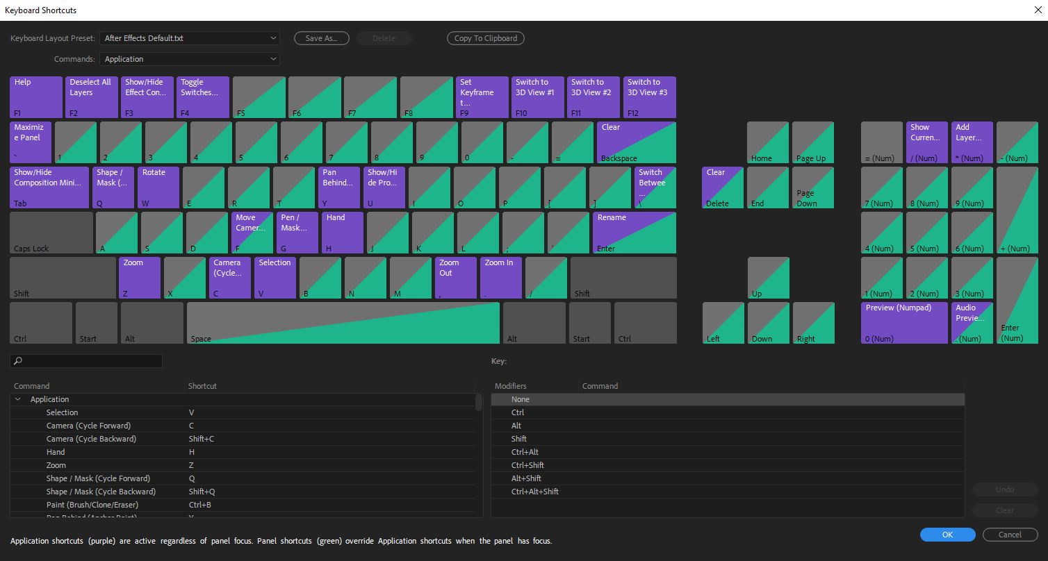
As part of a 3 month school project, my team and I investigated possible applications of AruCo markers and Computer Vision. We uncovered how there was a lack of customisation within physical computer controls. A complex command such as "Ctrl+Shift+D" is being used for a simple command "cut".
Since current solutions such as launch decks are expensive, we wonder if there is an opportunity to make the physical controls as simple as their digital counterparts for the masses?
Team
Carina Lim, Designer
Prasanth Kumaar, Designer
Yuan Jie, Designer
Under the supervision of
Dr Clement Zheng.
What I did
Design Research
Physical Prototyping
Digital Prototyping
Visual Design
Motion Design
Results
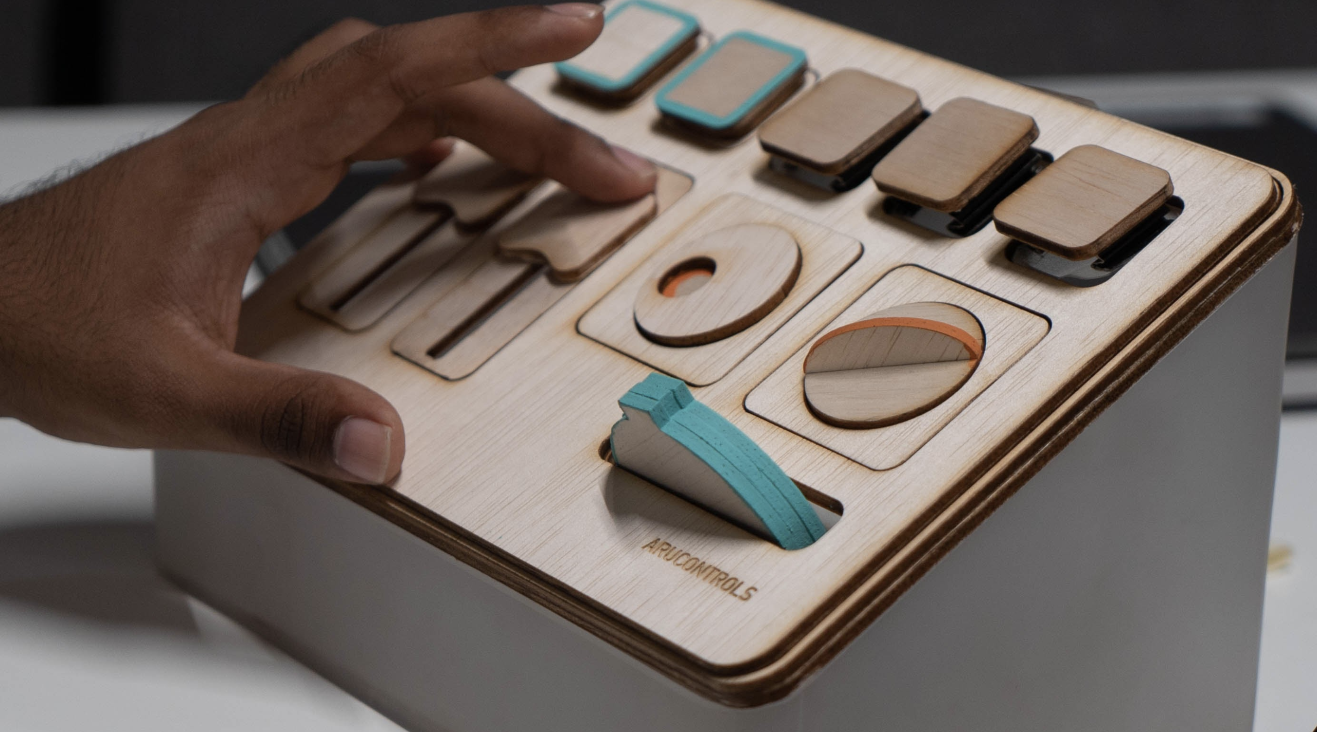
Built a fully functional high-fidelity prototype and app. (Download it here)
Researched and developed an architecture of physical-digital interactions.
Featured on Instructables.
IXDA Interaction Awards 2022 Shortlist.

In Summary
Most of us have always used the keyboard and mouse to interact with the digital world.
However, these peripherals are immuatable objects and can’t be modified to suit the users needs. Therefore, we wonder if an open-source technology like AruCo Markers* and Computer Vision* fill the lack of customisability?
What if anyone could create their own set of physical controls to interact with the digital world?
AruCo Markers* — An ArUco marker is a synthetic square marker composed by a wide black border, basically a QR Code.
Computer Vision* — A field of artificial intelligence that trains computers to interpret and understand the visual world (in our case we interpret the AruCo Markers).
Design Process
1. Discovery
Realised how computer vision creates an invisible bridge between physical and digital.
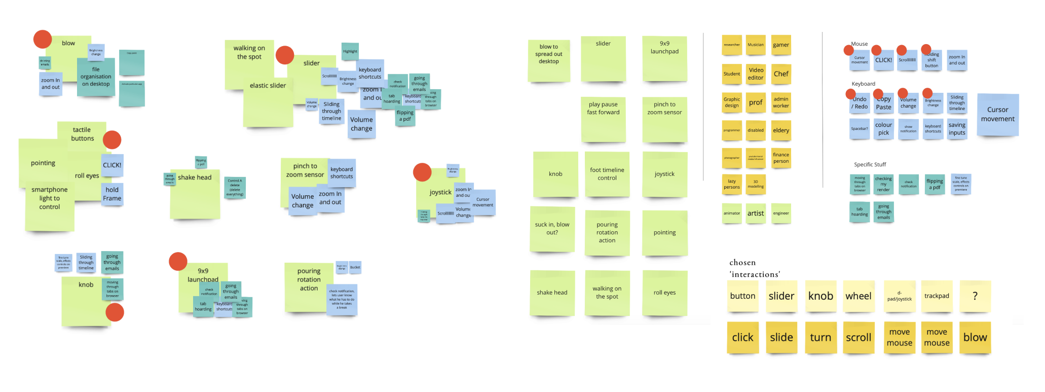
Conducted a few rounds of co-designing to gather and finalise ideas.
2. Define
Investigated on how there was a lack of customisation within physical computer controls.
This lack of customisation presents a gap between physical and digital simplicity in complex commands, such as "Ctrl+Alt+Del".
3. Prototype
Explored and mapped common digital functions (scroll, tap, mouse move) to physical actions (hand move, feet press, mouth).
Sensible DIY physical modules were explored with ergonomics and affordance.
4. Test
Iteratively built and user tested low-fidelity prototypes for our web-app and physical modules.
Discovery
Thinking, tinkering... and a lot of making.
We utilised some group brainstorming and rapid prototyping to gather some interesting ideas. We explored different materials, experiences to even "tech-stacks". This phase was meant to scope opportunities and understand limitations.
Who knew wizard of oz would feel so real?
Observation
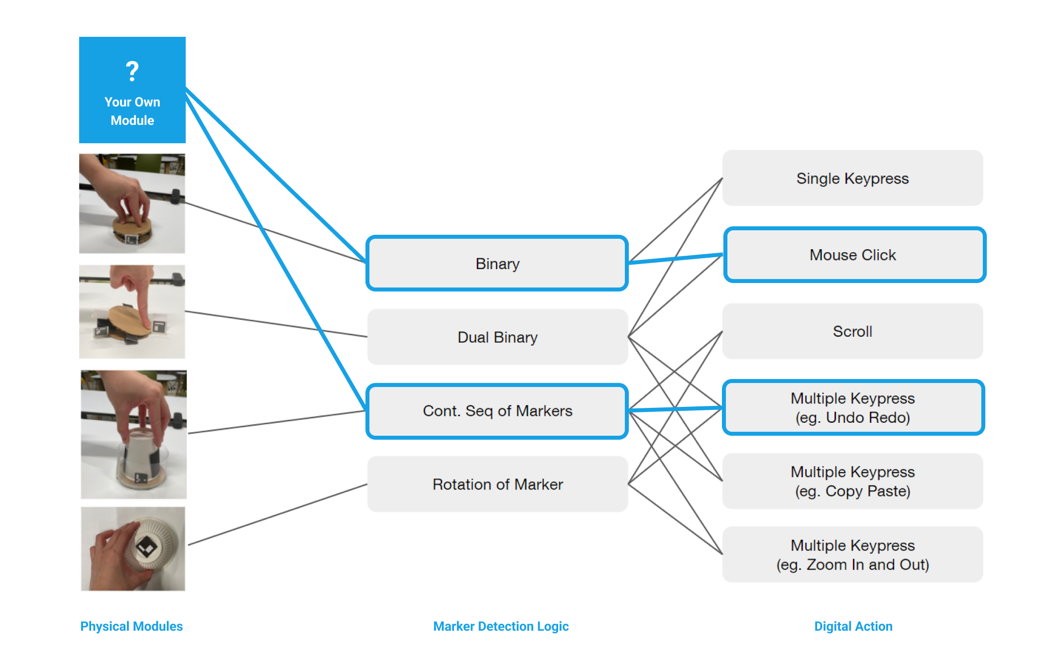
Eventhough AruCo Markers can only be activated and de-activated, the method of activation can afford many different physical interactions.
This is because physical movement can also affect marker detection, such as sliding, pushing or rotating the AruCo marker. We called this the Marker Detection Logic.


Defining
In many of today's applications, there are complex keyboard functions such as "Ctrl+Shift+D".
Yet, the only physical touchpoint is our keyboard and mouse.
We were intrigued by how there was an abundance of complex keyboard combinations, all of which makes the keyboard experience more complex.
What if we did not have adequate cognitive load (or physical ability) to utilise all of those complex combinations?
What if anyone could create their own set of physical controls to interact with the digital world, respecting their personality?

Designing a System
We explored simplifying Digital Actions through building usability-focused DIY physical modules.
We ended up with a system of logical actions and reactions of Physical Modules and Marker Detection Logic. This fundamental system essentially serves as a common ground for one to design their own controls by building their own physical modules using their imagination.

Physical Interace
Made with common, accessible materials.
Pushing for a more sturdy material, we refined prototypes to give it a coherent look, using DIY materials such as plywood.
We ended up choosing plywood and the laser cutting process due to its accessibility (with maker spaces popping up increasingly).
Testing and Refining
We tested our working high-fidelity prototypes with real applications.
With a working prototype in hand, all our digital and physical prototypes went through rounds of user testing to test its affordance.
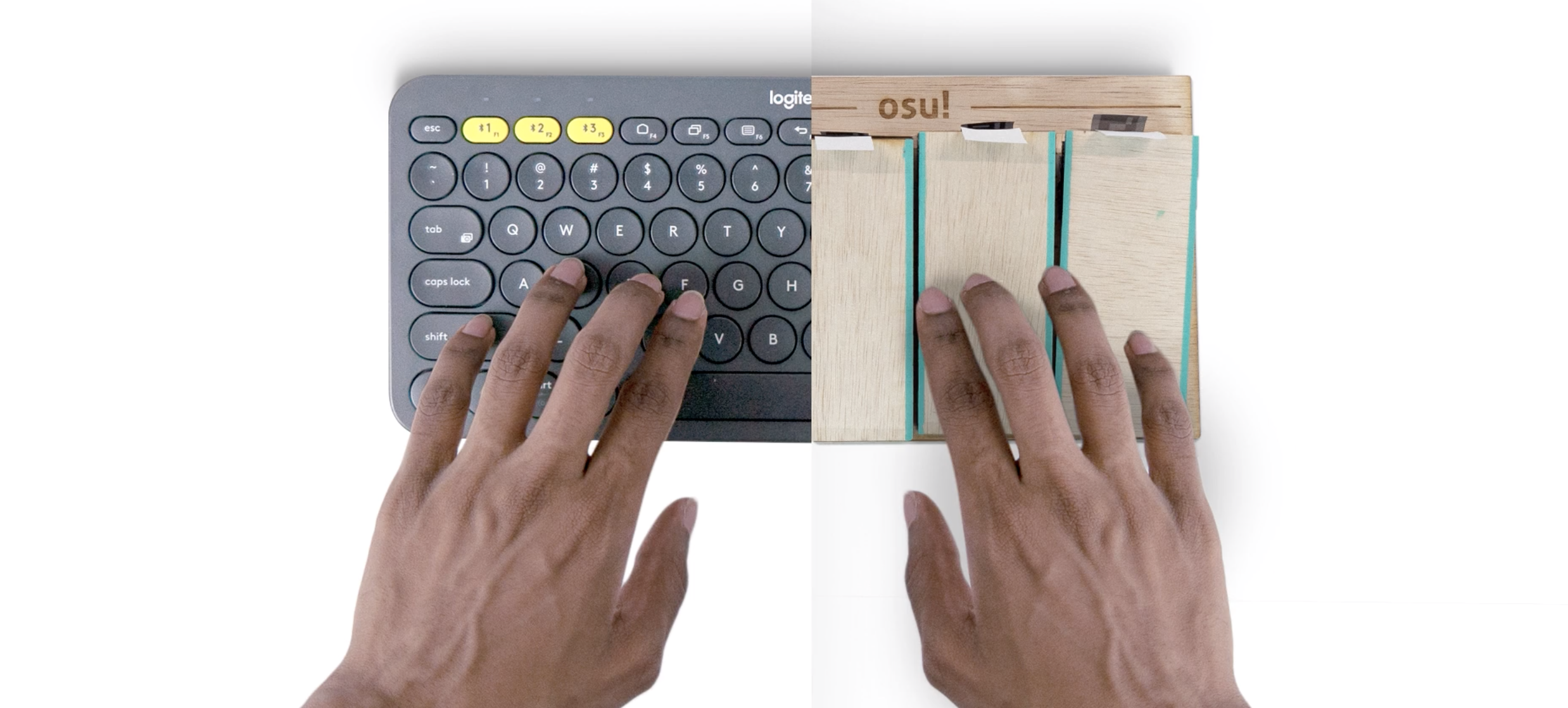
An example of a context is the OSU! game. The game OSU! uses four buttons played in a rhythm. AruControls enables a more tangible experience for OSU!
Other programs tested were:
1. Gaming Interactions (OSU!, Mario Kart)
2. Desktop Interactions (After Effects, Rhino)
What i've learnt throughout this semester project.
Lesson
Design can exist beyond physical and digital interfaces.
Our product didn't revolve around complicated services, nor beautiful interfaces, but it was a meaningful way of using existing physical and digital interfaces. Where we derive value is our broad understanding of both (physical and digital interfaces), and using them appropriately to create an interaction.
Lesson
Iterate not only our product, but everything around it. For example, clear communication is also a result of paying attention to every single detail and feedback from users.
When it boils down to explaining complex products like AruControls, we can only listen to feedback and design the clearest way to communicate to our stakeholders. This can mean paying attention to every single word used in our description, to headers in our promotional video. Iterate not only our products, but everything around the product.
